Neumorphism
Also called Soft UI, New skeuomorphism
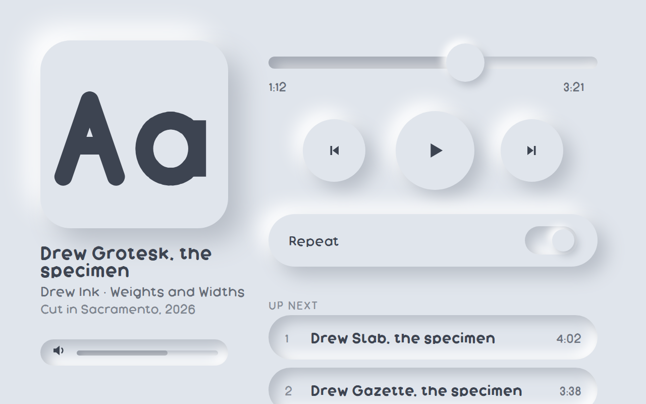
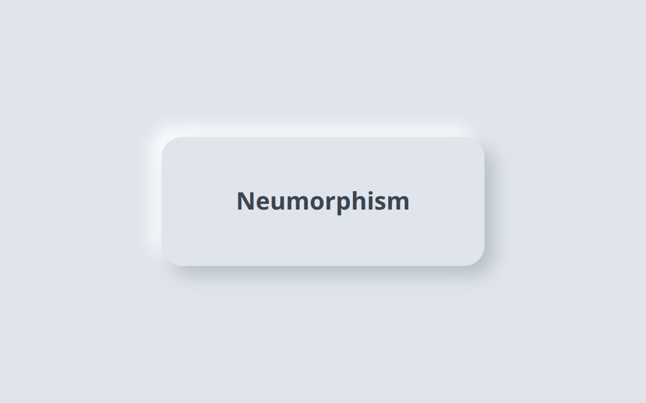
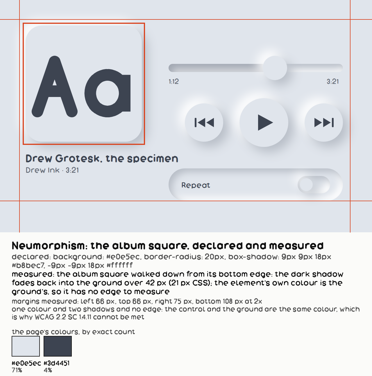
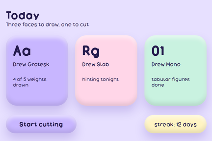
A control that appears to be pushed up out of the background or pressed into it, made of one colour and two shadows, with no edge of its own.
Near it
 Glassmorphism
 Claymorphism
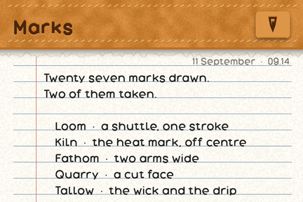 Skeuomorphism
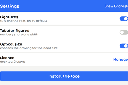 Flat design
What it looks like
What it is made of
| element background | identical to the ground | this is the definition; the moment they differ it is something else |
| two shadows | equal and opposite offsets, one lighter than the ground and one darker | the light one implies a single light source up and to the left |
| border | none | there is nothing to draw an edge with |
| radius | large, 16px and up | |
| what the person who named it says about it now | Malewicz: "Last year I unintentionally started the craze around Neumorphism, but as I predicted then, it didn't really take over the design scene. In that very first article, I also mentioned all the potential accessibility problems this style faces." His own thesis for where it works: "this style can work if used scarcely and if the objects on these backgrounds still hold their structure and readability without the decoration." | Michal Malewicz, "Glassmorphism in user interfaces". PARTIAL: the pull captured the preamble and the paywall, not the article body, so only the author's opening remarks are readable and they are about NEUMORPHISM rather than glassmorphism. Quoted here rather than on the glassmorphism entry because that is what the readable part of the file is about. An originator saying his own style did not take over, and that he raised its accessibility problems in the first article, is worth more than any later summary |
Where it came from
Named by Michal Malewicz in a December 2019 piece; the look was circulating on Dribbble before it had a name. It was widely discussed and almost never shipped, for the reason below.
Where it fails
Always, for anything that has to be operated. Because the control and the ground are the same colour, the boundary contrast is close to zero by construction, and a user interface component wants 3:1 against what surrounds it. Nothing about the technique can meet that without stopping being the technique. It is worth knowing as a word and worth admiring as a drawing; it is not a way to build a button somebody has to find.
Sources
- Neumorphism in user interfaces, Michal Malewicz not read
- WCAG 2.2, Success Criterion 1.4.11 Non-text Contrast, W3C not read