Reverse contrast
Also called Italienne, French Clarendon
A face with the weight in the wrong place on purpose: the horizontals are heavy and the verticals are thin, which is the opposite of every rule a broad nib produces.
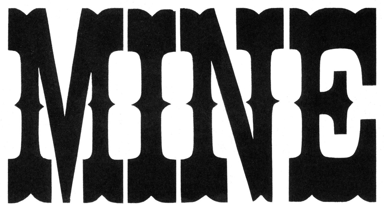
Near it
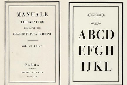 Didone
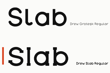 Slab serif
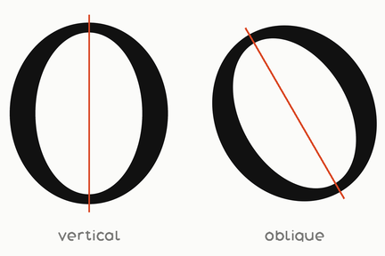 Stress
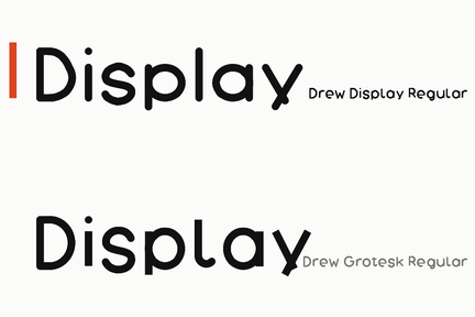 Display face
.jpg)
What it is made of
| what it is | horizontals drawn heavier than verticals, the reverse of what a broad pen does | |
| measured on this shelf, and the measurement is a nil | no family here has it | measured on the fixed shelf, 2026-09-28, which renders the o at 600px and counts pixels, because a counter is an AREA and a contrast is a RATIO and neither is in any table; the only face measured as heavier across than down is Drew Perforate, whose o is six dashes, and that is not a reversed pen. Until 2026-09-24 this row named Terrace at 1.159 as a hexagon with a flat top, measured on a build replaced before it shipped |
| so this entry describes the thing and not our version of it | UNMEASURED against our own work | said plainly rather than illustrated with a face that has none of it |
Where it came from
Nineteenth-century wood type for posters and playbills, where the point was to be seen rather than to be read. Revived deliberately in the 2000s.