Swiss typography
Also called International Typographic Style, Swiss style
The postwar programme that put text on a mathematical grid, set it flush left and ragged right in a neo-grotesque, and treated photography and white space as structure rather than decoration.
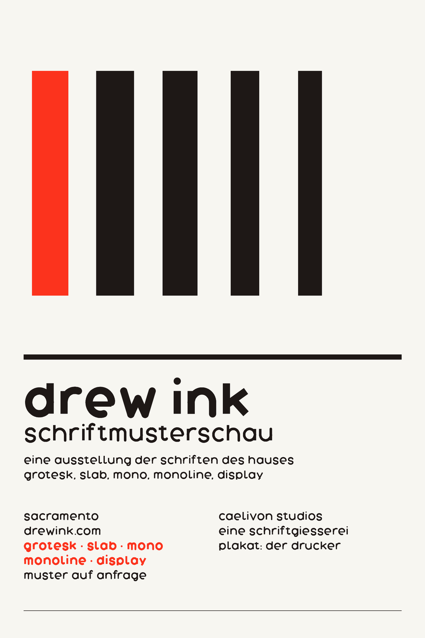
Near it
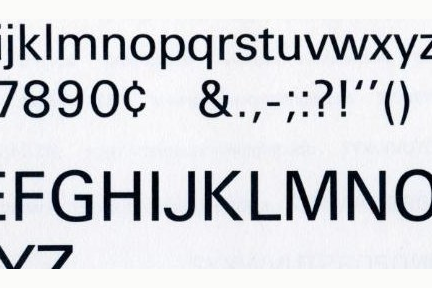 Neo-grotesque
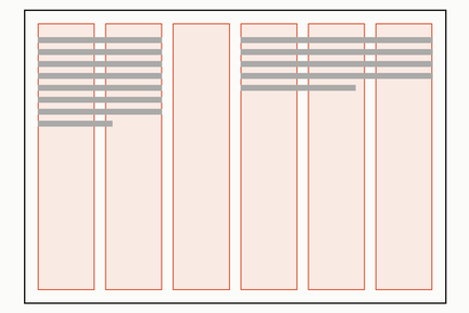 Grid
Grid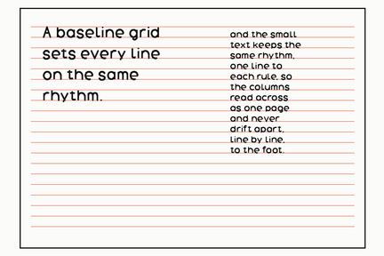 Baseline grid
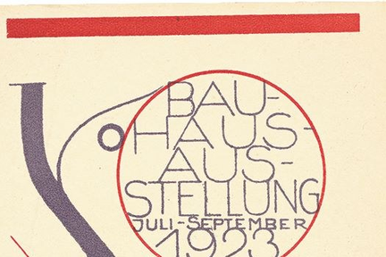 Bauhaus
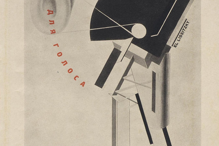 Asymmetric typography
 Metro
MetroWhat it is made of
| grid | modular, declared, and visible in the alignment | |
| face | a neo-grotesque, usually Akzidenz-Grotesk or Helvetica | |
| alignment | flush left, ragged right | justification was rejected as a distortion of word spacing |
| imagery | photography over illustration |
Where it came from
Switzerland in the 1950s, taught in Zurich and Basel. Josef Müller-Brockmann, Emil Ruder and Armin Hofmann are the names it is usually taught through.
Done well
- Grid Systems in Graphic Design, Josef Müller-Brockmann, 1981
Sources
- Grid Systems in Graphic Design, Josef Müller-Brockmann not read