Hierarchy
The order in which a page is read, made visible: what is seen first, second and third, decided rather than left to chance.

Public domain
Public domain: Printed in Parma in 1818, five years after Bodoni's death, and out of copyright everywhere; Commons tags the file public domain, and this house reads a faithful scan of a flat public-domain page as carrying no new copyright.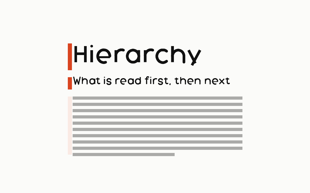
Near it
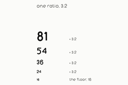 Modular scale
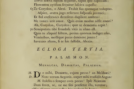 White space
 Alignment
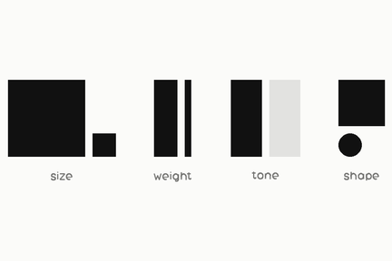 Visual contrast
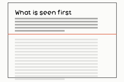 Above the fold
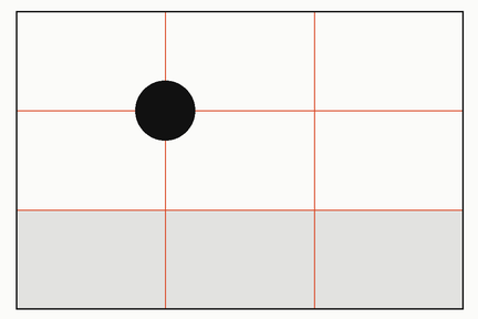 Rule of thirds
What it is made of
| size | the crudest signal and the first one a reader uses | |
| weight, colour, position, space | the others, and they compound | |
| HOUSE JUDGMENT, and measured on our own work | the site has TWO heading steps and no more: h1 at clamp(3rem, 7.6vw, 8rem) and h2 at clamp(2rem, 3.6vw, 3rem). At the ceiling that is 8rem against 3rem, a ratio of 2.67 to 1; at the floor 3rem against 2rem, 1.5 to 1. THE HIERARCHY IS WIDER ON A LARGE SCREEN THAN ON A SMALL ONE, by nearly a factor of two, because both ends are clamped independently | measured on this site's own stylesheet, which is the whole of its CSS |
| and that is the thing worth arguing about | a hierarchy that changes strength with the viewport is one a phone reader and a desktop reader do not share | named here rather than defended: it falls out of clamping two sizes separately and nobody chose it, which is exactly the kind of decision a count finds and a description never would |