Optical alignment
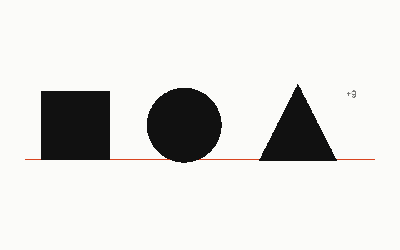
Aligning by what looks straight rather than by what measures straight, which is required wherever a shape is round, pointed or has a punctuation mark on its edge.
Public domain
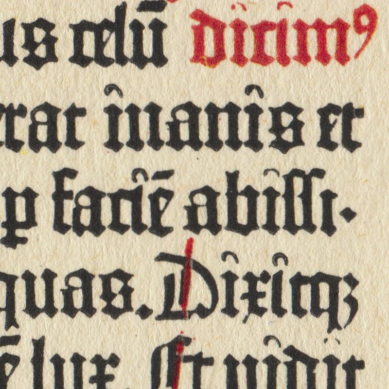
Public domain: Printed about 1455; the printer died in 1468, and the page is out of copyright everywhere; Commons tags the file public domain, and this house reads a faithful scan of a public-domain flat page as carrying no new copyright.Near it
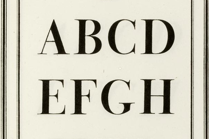 Alignment
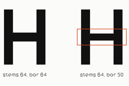 Optical correction
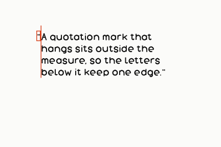 Hanging punctuation
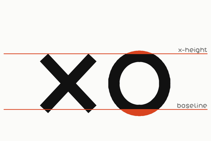 Overshoot
What it is made of
| what it is | setting a letter where it LOOKS flush rather than where its box is flush, because a round or an overhanging form reads as inset when its box is not | |
| HOUSE JUDGMENT, and this site does it in exactly one way, three times | every large heading on drewink.com carries margin-left:-.03em — the h1, the field h2 and the index head — pulling the letter back by three hundredths of its own size so its stem lands on the margin rather than its side bearing | measured on this site's own stylesheet, which is the whole of its CSS. Three hundredths of an em is about the side bearing of a capital at these weights, which is why it is that number and not a rounder one, and it scales with the type because it is in em rather than pixels |
| and it is applied ONLY at display sizes | no body text on the site carries it | below a certain size the correction is smaller than the rendering error it would fix, which is the honest reason and not a shortcut |