Optical correction
Drawing something measurably wrong so that it looks right, which is most of what separates a drawn letter from a generated one.
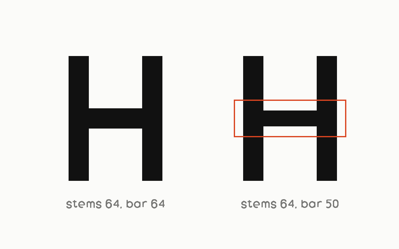
Near it
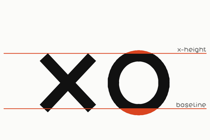 Overshoot
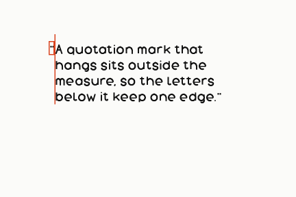 Hanging punctuation
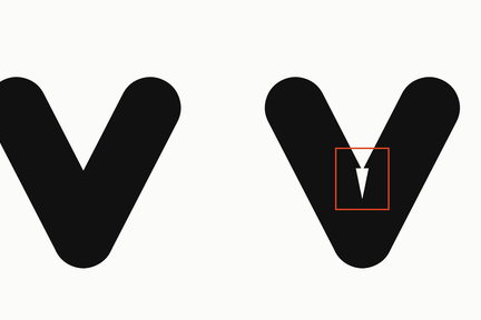 Ink trap
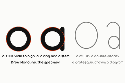 Geometric sans
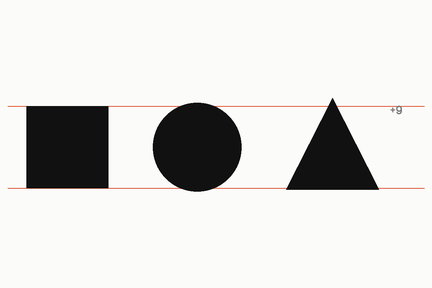 Optical alignment
What it is made of
| what it is | drawing a thing wrong on purpose so that it looks right | |
| this shelf makes it, one: the overshoot | round letters are drawn past the line the flat ones stop on: on the capital O, 1.9 per cent of the cap height on eight families and up to 8.9 on Drew Poster, sixteen families in all | see the overshoot entry for the whole table, measured on the fixed shelf 2026-09-24 |
| this shelf makes it, two: the crossbar | the H's bar sits ABOVE the true centre on 19 of 23 families, sixteen of them between 0.52 and 0.61 of the cap height | a bar on the exact middle reads low. Nothing in this tree instructs that; it is in the drawing. Measured on the fixed shelf, 2026-09-24; see the crossbar entry |
| and this shelf does NOT make the third | thinning the horizontals where they cross a vertical | the four walls of the o differ by at most 1.083 to 1 on twenty-one of the twenty-three families, so the shelf is monolinear and a crossing is as thick as the strokes that make it. Named here as not done rather than left out, because a list of corrections a house makes is only useful beside the ones it does not |